

Dating is supposed to be fun, exciting and safe. Chance was created keeping exactly these in mind. With all the appearance-first dating apps populating the dating scene, personalities often tend to be saved for later, even sometimes overlooked. Chance stands out with its ‘personality first’ aspect of dating. Because we’re more than just our photos.
Role: UX + Brand Designer
Company: Chance Dating App
What I did: Recruiting Users, User Interviews, UXR, UX Design, Visual identity, UI Design, Usability Testing, Prototyping
Tools: Figma, Adobe Illustrator &
Photoshop, Zoom
Project Duration: Spring 2020

My Role
The idea of the Chance App was built imagining a space where people are given a fair shot at dating, without being critically assessed by the perfection of the photos they upload. My task was to design a product that could incorporate the most important key feature which was keeping the profile anonymous and matching with the personality.
The project was divided into 4 iterative phases, with each phase involving meetings with the client to present deliverables, handoff revisions, and discuss next steps.
Discovery
The current dating space is dominated by appearance-first apps. We wanted a premium-looking app which is usually simple and classy but we also had to make it fun because we're targeting the new generation.
Understanding The Market
Learning is a non-linear process. Throughout the project, I conducted market and competitive research to understand the needs and gaps of this growing space. I also initiated multiple stakeholder interviews to ensure I could meet my client’s business requirements.
My research process involved the following:
-
Define objectives & plan
-
Outline hypotheses & assumptions
-
Select methods to fill gaps in knowledge
-
Conduct research and gather data
-
Synthesize findings
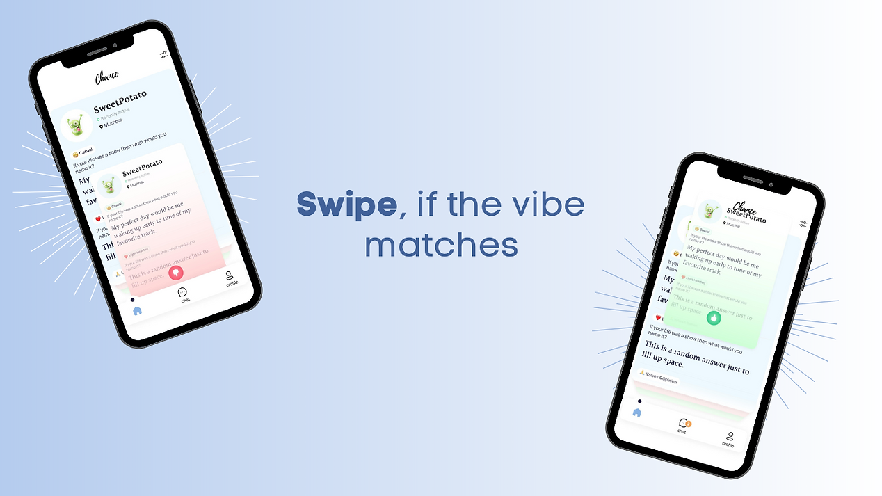
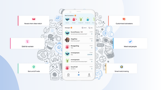
Chance was made keeping in mind the GenZers, the career-oriented, the shy, the nerds, the chatty, the hobbyists, the introverts, extroverts, ambiverts and more. Put your best foot forward! For all those who seek to have meaningful conversations with people. Forget the superficial small talk and have deeper conversations with your matches. Personality dating like never before. Because you deserve what dating deserves, a real Chance!
Insights And Issues
• Appearance First Market:
The majority of the apps focus on appearance and ignore the real person behind the photo. Today, Gen-Z wants to connect with people, not profiles.
• Lack Of Privacy And Anonymity
Identity, photos and personal details are revealed to several people even before people find a match.
Users have less control over their profile and who sees it.
• First-Hand User Pain Points
Shortage of matches for men due to unbalanced M : F ratio.
Awkward run-ins with familiar faces.
Unwarranted male attention and unsolicited images.
Repetitive and monotonous small talk.
All research presented to my client in a slide deck
Exploration
While exploring product strategy, I created an empathy map to extract patterns of user needs and frustrations and laid out the site’s information architecture. Using the research insights as feature value propositions, I also created a list of features to determine must-haves for an MVP website. Prioritization was determined with an impact vs effort analysis. This phase lays the groundwork for later wireframe solutions and content strategy.

Information Architecture
I proposed a sitemap incorporating core content for personalising your profile, swiping up & down, chatting, and your preference.

Sketches & Wireframes

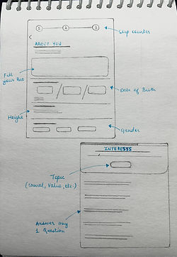
.jpeg)
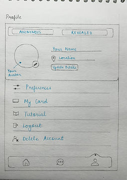
Brainstorm sketches on early concepts of content layout and dialog components.
Design & Iterate
Wireframe designs were iterated upon through usability testing and client feedback, with each iteration improving on design choices and visual hierarchy.
I was able to observe participants’ interactions and had them “think aloud” as they navigated through a prototype.

High-Fidelity Designs


Branding
Brand design was done concurrently with wireframe iteration. I gathered logo and brand requirements from the client and sketched out several concepts. We went through two feedback and iteration sessions before deciding on a final logo design.
Logo iteration


Various logo concepts based on client requirements.
Imagery

Moodboard imagery was developed with the client to align on brand direction.
Style Tile

The final style tile brings together UI elements that dictated the high-fidelity designs.
Reflection
At the moment Chance’s design work is paused to allow business planning to catch up. Per the client’s timeline, our next steps are as follows:
-
Refine logo design to seamlessly work across all possible digital and printed business materials.
-
Iterate and test further wireframe designs based on likely business changes.
Personal Learnings
1) Adapting to changing requirements
Chance is a startup project where the design work came in a little early before established business planning. I learned a lot about creating visual branding when there were changing requirements and no concrete assets to work off of. It was rewarding to see our app solution be crafted from scratch.
2) Clear client communication
One aspect that surprised me was how significantly the time difference between myself and my client could affect the process. I was challenged to work efficiently, maintain good communication with the client at every step of the process, and ensure that any product test participants were scheduled properly.
3) Align goals throughout the process
When confusion happened between my client and me, I noticed it was usually due to misaligned expectations. Realigning goals and reviewing business needs, development considerations, and customer insights helped bring us back on the same page. My client found it helpful to learn more about users’ needs, as there were human-centred aspects that he had not thought of during business planning.
